An AI-built screen can use every approved color and still make the next step difficult to find. Before asking for another redesign, give the agent a smaller assignment: preserve the user’s task, improve one screen, and return evidence that the task still works.
Here is a practical review brief you can copy, plus a worked note-saving example. It is intended for a prototype or a separate development copy. The examples are invented; this is not a report of hands-on testing of a commercial design tool.
What prompted this checklist
In its September 30, 2026 account of building Pencil, Liner describes separating planning, design and review. The team argues that supplying a design system does not settle a screen’s information priorities, and that vague visual feedback needs to become specific instructions. That is a useful starting point for a small product team: treat the design document as input, then inspect what people can actually do.
The Google Labs DESIGN.md specification provides a structured way to express visual rules. It is not evidence that a generated screen is usable, that your particular agent automatically loads the file, or that an interface has passed accessibility testing. Explicitly tell your tool which project references to read.
Write the task before touching the buttons
Start with one real journey. For a note app, it might be: open an existing note, change its title, save, return to the list, and reopen it. The important outcome is the saved title, not how many cards the agent can rearrange.
Keep a baseline screenshot and a recoverable copy of the current implementation. Include uncommitted work in that copy; a branch name alone does not prove every local file has been preserved. Ask the developer or agent to identify the exact baseline before making changes.
| Brief field | Example for a note editor |
|---|---|
| User’s purpose | Correct a title and keep the note’s existing body. |
| Entry and exit | Enter from the notes list; finish back on that list. |
| Must remain | Existing content, cancel behavior, saved-note identity and navigation. |
| Allowed change | Button emphasis, grouping, spacing and concise labels. |
| Out of scope | New accounts, data migration, pricing, permissions and publication. |
| Evidence | Before/after views and a recorded save-and-reopen check. |
Use your existing component library and token files as the starting point. If they disagree with a planning document, have the agent report the mismatch rather than invent a third set of colors.
Make the main action easy to recognize
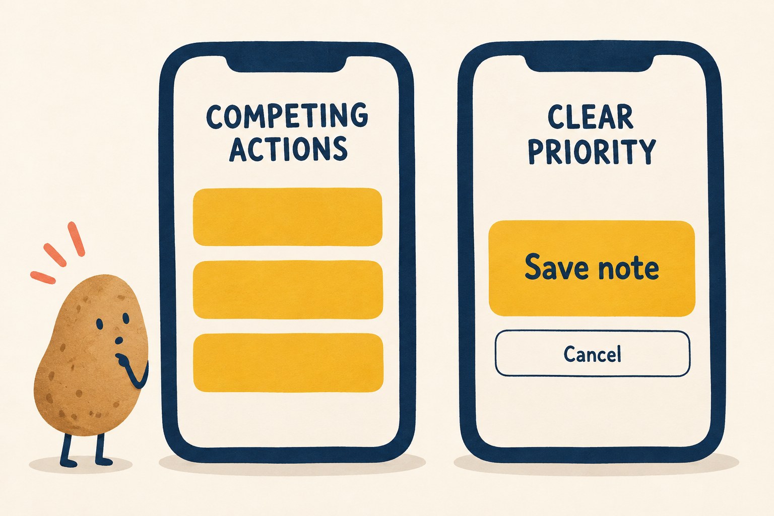
For this example, saving the edit is the main action. Give it a recognizable button treatment and a label that names the result. Keep Cancel available, but do not give it identical visual weight just to make the layout symmetrical. A destructive action such as Delete belongs in a clearly distinguished place.
This is a hierarchy exercise, not a rule that every screen may contain only one button. Search, filters and navigation can all be necessary. The review question is whether a person can distinguish the action that completes the current task from alternatives and ordinary text.
- Read every label without its surrounding explanation. Does “Continue” say enough, or would “Save note” be clearer?
- Compare the same action across screens. A primary button should not become unmarked text on the next page.
- Check disabled and loading treatments. A user should not mistake a pending save for a successful one.
- Keep essential secondary actions discoverable. Smaller visual emphasis must not mean tiny hit areas or unreadable contrast.
Review the states that a polished screenshot hides
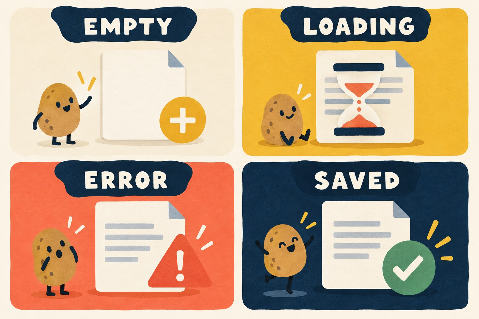
Ask for a state inventory before approving the redesign. A beautiful filled-in screen says little about the first visit, a slow response or a failed save.
| State | What to inspect | Evidence to request |
|---|---|---|
| Empty | There is a clear way to begin, without sample content pretending to be yours. | Open a fresh test record. |
| Loading | Status is understandable; repeated taps do not create duplicate work. | Use an approved slow-response test. |
| Error | The message says what can be done next and preserves the draft where appropriate. | Trigger a controlled save failure in a test environment. |
| Saved | The UI reports completion only after the operation succeeds. | Leave, reopen and inspect the saved result. |
| Cancel | Leaving follows the product’s existing policy for unsaved changes. | Edit, cancel, reopen and compare with the baseline. |
Do not manufacture failures against live customer data. Use fixtures, a simulator or another approved test setup. If a state cannot be tested, mark it untested. “Looks fine” is not a substitute for a persistence check.
Check interaction, not only appearance
On the web, walk through the screen using a keyboard as well as a pointer. You should be able to see which control has focus; W3C’s Focus Visible explanation describes why that indicator matters. A screenshot without focus does not establish keyboard usability.
Also inspect the actual clickable area. WCAG 2.2’s minimum target-size criterion uses 24 by 24 CSS pixels with specified exceptions, including spacing. That is a web criterion, not a universal native-app measurement. Check the relevant platform guidance for a native app and avoid claiming compliance from an illustration.
- Try a narrow viewport and enlarged text. Important labels should remain understandable and reachable.
- Open the on-screen keyboard where applicable. Confirm that it does not hide the action needed to finish.
- Check focus order, accessible names and meaningful headings using appropriate tools.
- Verify contrast with measurements, not visual confidence alone.
- Run the original end-to-end journey again after a styling change.
These checks are a starting review, not a complete accessibility audit. Record the device, browser or simulator, text settings and states actually checked.
Copy this bounded agent brief
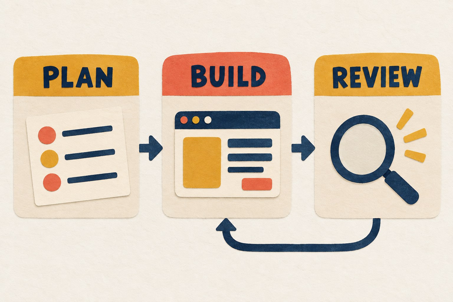
Task: Improve the usability of [screen] in an isolated, recoverable copy. Preserve [existing journey], [data behavior] and [navigation]. Read [design reference], [component source] and [current implementation] before editing.
Plan: Identify the user’s main action, the information needed before it, and the secondary actions that must remain. List concrete problems with locations. Do not add features merely to fill space.
Build: Reuse existing components and tokens. Improve hierarchy, action labels and spacing within the stated scope. Do not change account, payment, permission or backend behavior.
Review: Exercise empty, loading, error, saved and cancel states where relevant. Check a narrow screen, enlarged text and keyboard interaction. Report the exact environment, evidence, untested states and any regression. Do not publish or merge without the project’s normal approval.
Keep a review receipt instead of another vague prompt
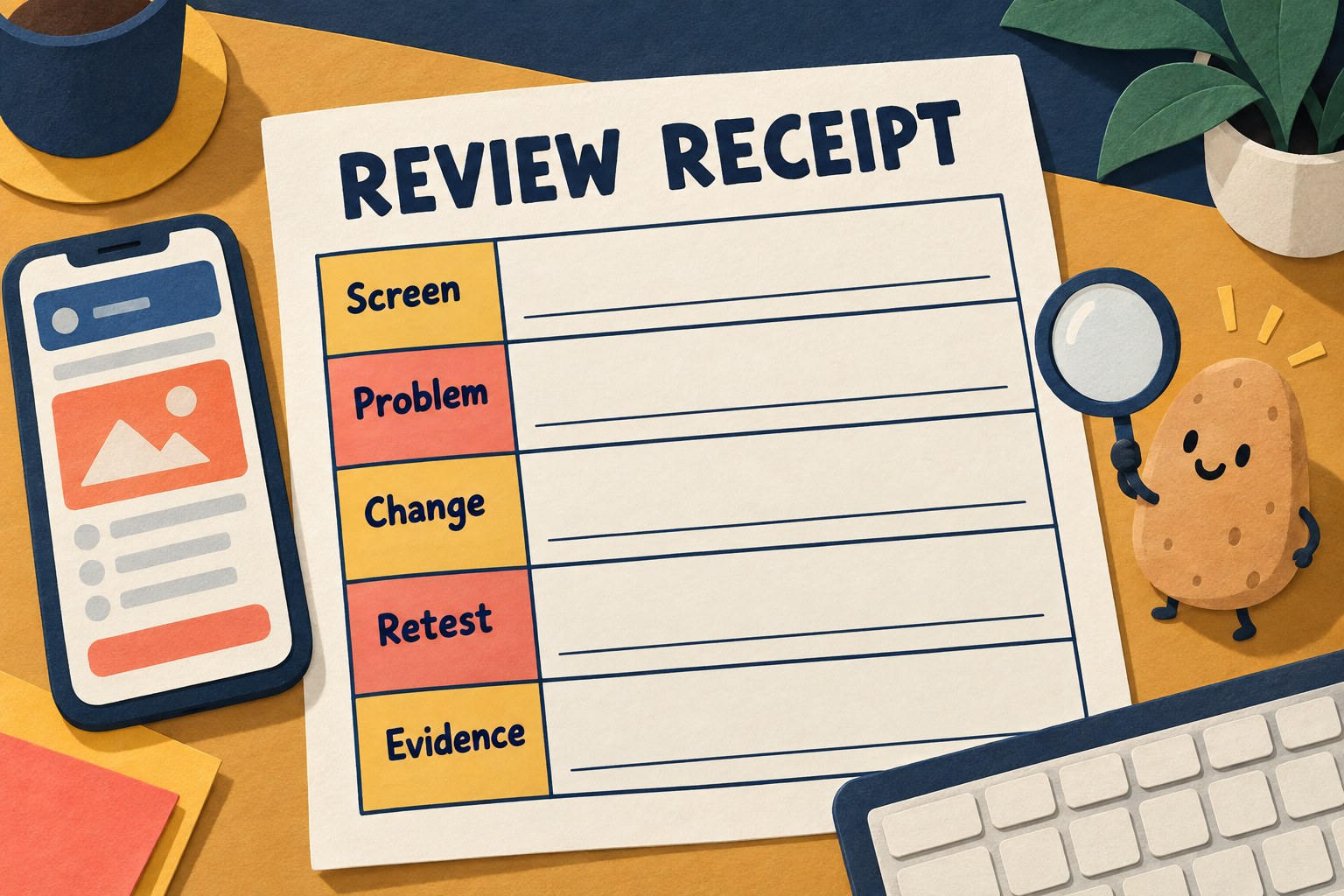
A useful finding contains an observation, a consequence, a proposed change and a retest. For example: “At narrow width, Save note wraps beneath the keyboard and cannot be reached. Keep the action reachable without hiding the draft. Retest with the keyboard open and enlarged text.” That is more actionable than “make it premium.”
- Screen and state: ______
- Observed problem: ______
- Effect on the task: ______
- Smallest proposed change: ______
- Behavior that must remain: ______
- Retest and evidence: ______
- Still unverified: ______
Finish when the agreed journey works and the reported problems have been checked again. Keep optional cosmetic ideas in a separate list. A screen can always acquire another rounded rectangle; the reader mostly wants to save the note and get on with the day.
If you are deciding whether an AI workflow helps at all, start with our one-task AI experiment. For longer jobs, the long-task handoff brief helps keep completion criteria visible.