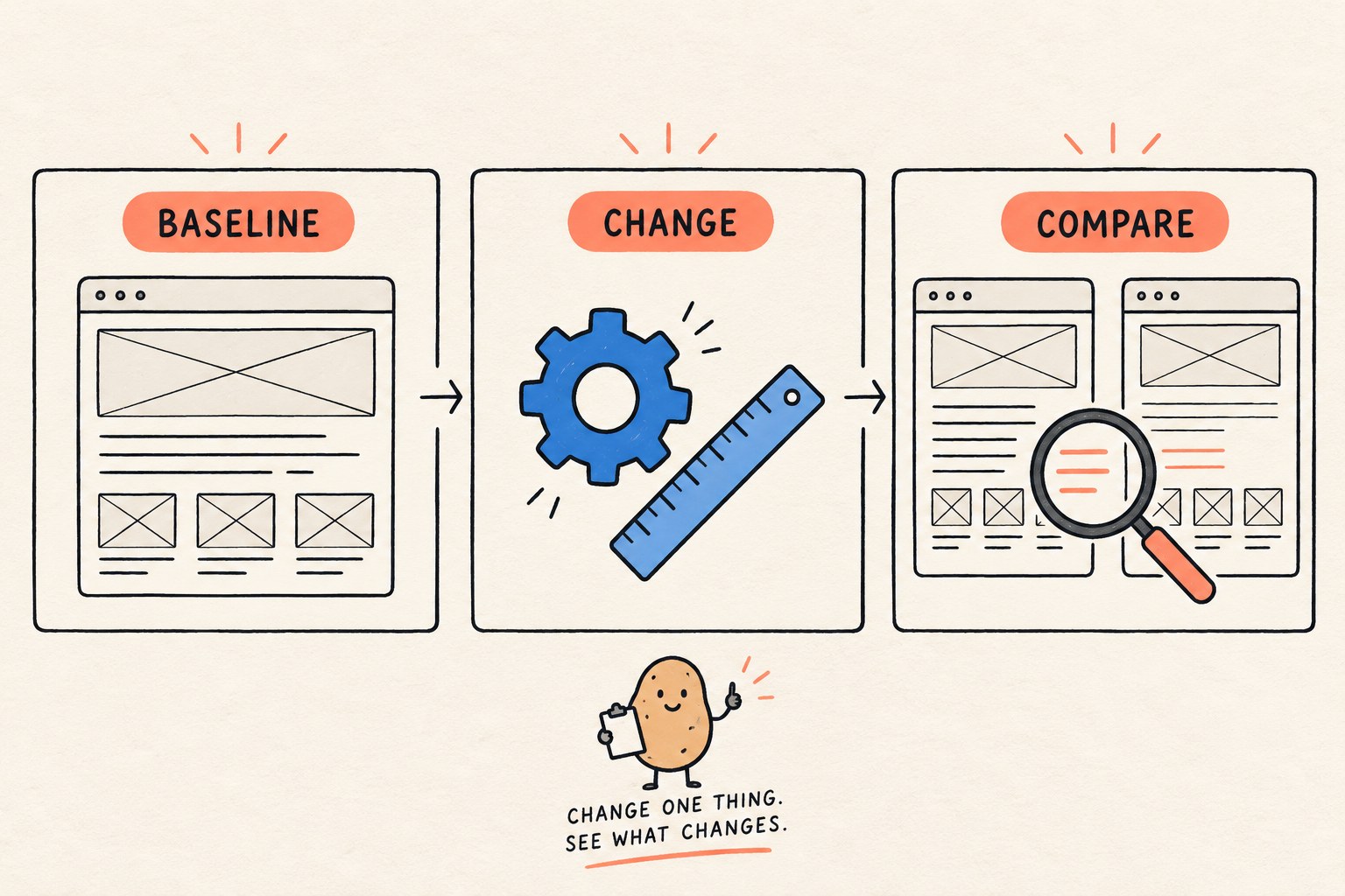
Before changing a design system's spacing or typography, save one representative page and its test conditions, then compare the same content after each change. Check heading meaning, narrow layouts and user-adjusted text spacing separately. A tidier screenshot is not enough to approve the migration.

A page can look wonderfully compact until a long title arrives. Then the button becomes a letterbox and the paragraph starts negotiating with the footer. The useful question is not simply “Does it look better?” It is “What changed, under which conditions, and can people still finish the task?”
This guide offers an original review record for a small site's CSS refresh. It is a proposed workflow, not a report of testing W3C's website or a claim that the example passes accessibility requirements.
What W3C changed, and what that means for your review
W3C's October 9, 2026 announcement describes a website design-system update published at the end of September. It introduces fluid typography and a 1.125 type scale, changes spacing rules and removes some wrappers. This is an update to W3C's own website design system, not a new requirement for every website to use that scale.
The September changelog gives two migration details worth noticing: old text-size classes still map to new classes, while the former prose wrapper is removed and line-length limits move onto text elements. Compatibility in one area does not establish compatibility everywhere. If your site uses this system, compare your actual version and markup with its changelog. If it does not, borrow the review method rather than copying class names into an unrelated project.
Choose a small review set with awkward content
Start with three real page types: a prose page, a listing and a form. Give each a named reviewer and a saved baseline. Use a staging copy or local development build so a spacing experiment cannot interrupt a live customer task. Do not include private customer data in screenshots.
- Prose: include consecutive headings, a paragraph, a nested list and a link that wraps.
- Listing: include a short title, the longest title you actually publish, an empty state and a card with missing optional metadata.
- Form: include a long label, help text and a validation message. Check the expanded error state, not only the pristine form.
Record browser and version, viewport width and height in CSS pixels, zoom, content fixture and build identifier. Use the same values on both sides of a comparison. Otherwise a different font, title or viewport can masquerade as a CSS regression.
Separate a size change from a structure change
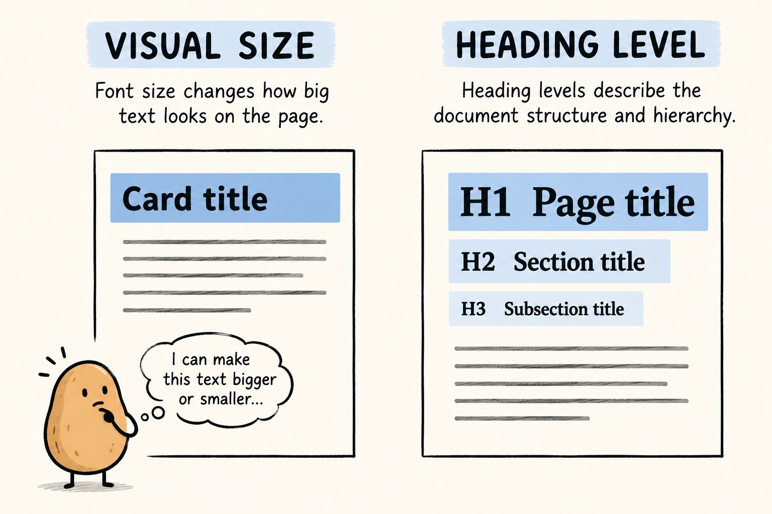
Do not “repair” an oversized heading by changing its HTML level. Decide where the heading belongs in the document, then choose its visual treatment. Adobe's typography migration guide makes this distinction explicitly: typography classes control presentation, while appropriate heading elements preserve document structure.
For a wrapper removal, inspect the old wrapper before deleting it. In your project it may also be a JavaScript selector, an anchor target or the owner of a layout rule. Make a short dependency note: “Only styling,” “Behavior also attached,” or “Not yet checked.” An unexamined dependency belongs in the last category.
After each small change, compare the same page at the same state. If the new gap is wrong, identify the rule that now supplies it before adding another override. A pile of compensating margins can hide which component is responsible for spacing.
Use a review matrix instead of one perfect screenshot
| Review state | What to inspect | What to record |
|---|---|---|
| Normal baseline | Heading order, readable text, spacing between sections and reachable controls | Build, viewport, browser, zoom and content fixture |
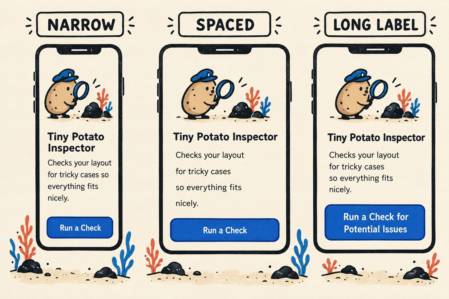
| Narrow vertical page | Text wraps; important content and controls do not disappear outside the page | The exact width and any element requiring horizontal scrolling |
| Text spacing override | Labels, help text and errors remain available without collision or clipping | The applied values and the exact failing element, if any |
| Long label or title | Wrapping does not cover adjacent controls or hide the action | The actual text, language and state used |
| Keyboard path | Controls can still be reached and their focus is visible after layout changes | The sequence tested and any trapped or obscured control |
For a vertical page, W3C's Reflow explanation uses a width equivalent to 320 CSS pixels. It also explains the equivalent 1280-pixel starting viewport at 400% zoom and exceptions for content that genuinely needs two-dimensional layout. A data table's exception is not a reason to let the surrounding paragraphs require sideways scrolling. Keep the actual viewport and zoom in the record rather than writing only “mobile passed.”
For text-spacing review, the Text Spacing explanation specifies simultaneous overrides, without changing other style properties: line height at least 1.5 times the font size, spacing after paragraphs at least 2 times, letter spacing at least 0.12 times and word spacing at least 0.16 times. These are adaptability checks, not mandatory default design values. Apply only relevant properties for the language and script, confirm the override actually took effect, and look for lost content or functionality. Do not infer a full accessibility pass from these two checks.
Copy this layout-change record
Keep one record per change. Add links to your own baseline and revised evidence; do not put private screenshots in a public issue.
Page / component:
Baseline build → proposed build:
Changed rule or removed wrapper:
Reason for the change:
Browser + version:
Viewport in CSS pixels + zoom:
Content fixture / language / UI state:
Baseline evidence:
Revised evidence:
Observed result (describe, do not guess):
Unchanged behavior checked:
Remaining uncertainty:
Decision: accept / revise / not yet checked
Owner + next action:
Rollback reference:
Hypothetical example: a team reduces a listing title's visual size. Its normal-width capture looks cleaner, but a longer title at the narrow test width pushes the action below a fixed-height card and out of view. The record should identify the card and clipped action, not say “font problem.” The next experiment could remove the fixed height on that staging component and repeat the same case. This is an illustrative diagnosis path, not a measured result from W3C or Knee Potato.

Decide what is ready, and what still needs checking
Accept a change only when the named reviewer can trace the new layout to the intended change and the selected task still works. Keep untested browsers, languages and states visible as gaps. If you find a regression, keep the before-and-after evidence, revise the smallest responsible rule, and rerun the affected cases before widening the rollout.
When an AI coding assistant implements the change, attach the record and the exact failing case to the request. “Make it cleaner” leaves too many decisions implicit. Our UI review brief guide helps turn the visual goal into reviewable instructions. If the problem appears only inside an embedded page, use the separate iframe host-and-embed handoff to keep the two layout owners clear.
The finish line is a smaller, explainable change with recorded evidence. The potato may enjoy a makeover; the reader still needs the button.