Before changing a table to a single-axis scroll container, write down which element should scroll horizontally and which should scroll vertically. Then compare the same page in your target browsers, including sticky labels and scripted navigation. A browser accepting the CSS syntax is not proof that it implements the behavior you need.
A table can look perfect at the top of a page and lose its labels halfway down. The useful review is a short journey through the content, not a screenshot of its starting position. This guide offers an original observation worksheet; it does not report a browser compatibility test performed by Knee Potato.

Separate the announcement from your release decision
Chrome's September 4, 2026 developer-testing announcement, checked October 11, describes combining a scrollable overflow value with clip to create a scroller on one axis. It identifies Chrome 154 Beta, Dev and Canary as testing channels without a flag. Treat that statement as a dated testing invitation, not a universal stable-browser guarantee.
The same announcement recommends CSS.supports("named-feature(single-axis-scroll-container)") for capability detection. Merely checking whether overflow: auto clip parses does not establish the revised behavior. Record the capability result alongside the actual browser version and channel; still test the user journey.
Start with a two-axis intent record
Use a representative page with enough rows and columns to overflow. Replace private customer content with invented labels before sharing a reproduction. Keep the same viewport, zoom, content and application revision across comparisons. If you change any of them, give the run a new row rather than quietly overwriting the old result.

| Question | Example intention, not a test result | Your observation |
|---|---|---|
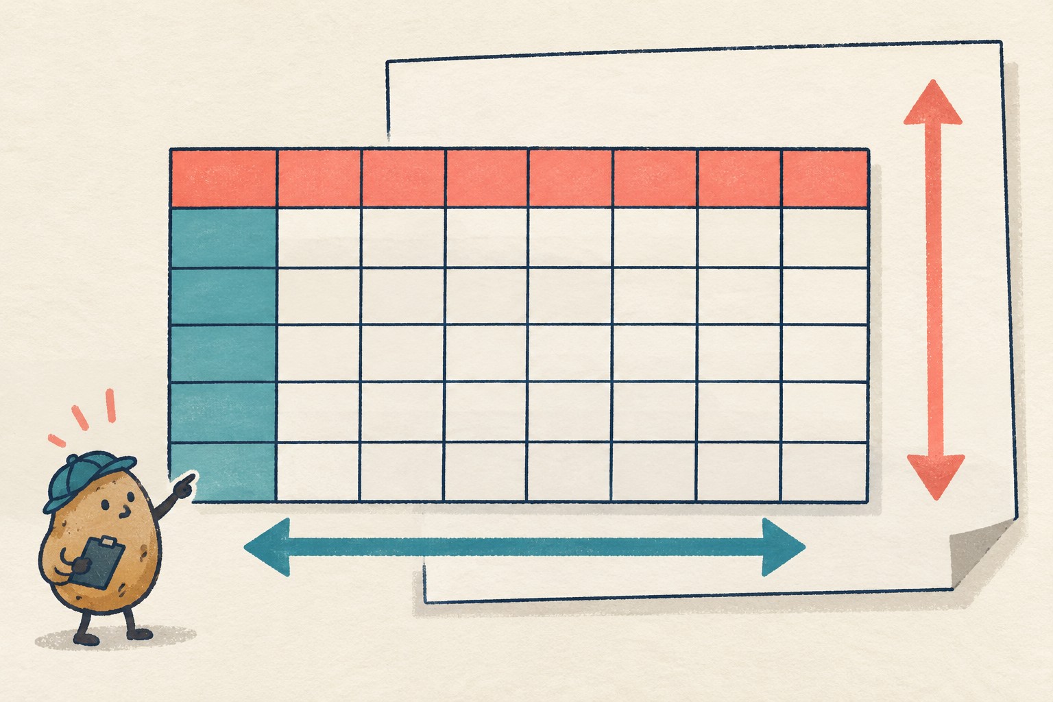
| Horizontal movement | The table wrapper moves through columns. | Element selector and visible movement: ____ |
| Vertical movement | The document moves through rows. | Element selector and visible movement: ____ |
| Top labels | The header remains useful while moving down the table. | Where it sticks and when it stops: ____ |
| First-column labels | The row label remains useful while moving across. | Where it sticks and any overlap: ____ |
The proposal explainer distinguishes the two axes: a sticky descendant can be constrained by different scrolling ancestors on each axis. It also distinguishes clip from hidden: the former prevents movement on the clipped axis, whereas the latter can still permit scrolling through script. These are reasons to check more than a drag gesture.
Run the same short route twice
- Begin at the start. Note browser, full version, channel, operating system, viewport, zoom and capability result. Capture the initial layout.
- Move across. Reach a middle column, then the last column. Can you still identify the row? Note any label collision rather than simply writing “sticky works.”
- Move down. Stop midway and near the table's end. Can you identify the visible columns? Check the corner where the header and first column meet.
- Use the application's navigation. Try the existing “jump to item,” selected-result or focus action, if the page has one. Record what moved before and after that action. Do not run unfamiliar pasted scripts on a live account.
- Return and repeat. Follow the identical route in the comparison browser. Keep a separate observation for each run, including an explicit “not tested” where needed.
Use the input methods your audience needs, such as keyboard navigation and touch, rather than assuming a mouse result covers them. A useful note names the action and the content that became inaccessible. “After jumping to row C, the column label is covered” gives a developer something to reproduce; “scrolling is weird” mostly gives them a mood.

Check the surrounding layout, not only the header
Chrome's testing announcement also calls out overscroll behavior, programmatic scrolling and automatic minimum sizing in flex/grid layouts as affected areas. For your page, add only relevant checks: compare container bounds, surrounding controls and any existing edge-of-scroll behavior. A repaired header does not excuse a newly oversized panel.
For example, suppose a comparison page looks correct at the initial viewport, but its “find result” action leaves a label unreadable. That hypothetical result is a failed task check even if the capability query returns true. Keep the original layout available while investigating; do not turn a single CSS declaration into an automatic approval gate.
Copy this compact handoff
Page / component:
Application revision:
Browser / full version / channel / OS:
Viewport / zoom / input method:
Capability query result:
Horizontal scrolling element:
Vertical scrolling element:
Exact action sequence:
Expected visible label or target:
Observed result and first differing step:
Evidence file (redacted):
Comparison run:
Decision: keep / investigate / ready for wider testing
Owner and next check:
Mark “ready for wider testing” only when the recorded route meets your intended behavior. It is not a cross-browser certification. Keep unresolved cases attached to the handoff rather than hiding them in a green summary. If the page also contains a responsive embedded document, use the separate host-and-embed checklist for that boundary; it answers a different question.