If you read code in more than one editor or terminal, check a font update in each place you actually work. This guide gives you a small, repeatable review card for D2Coding 1.4.0: record the selected build, compare the same text with one setting changed, and keep enough detail to explain a rendering problem.
NAVER's October 3, 2026 release adds an optional dotted zero, corrects some FreeType baseline behavior and removes four period-related ligatures. Those are three different checks. A zero preference should not distract from whether punctuation remains readable in the code you use.
This documentation-based guide was checked October 8, 2026. The worksheet and sample below are original review aids. We have not installed the font or tested it in an editor; the illustrations are conceptual and do not reproduce D2Coding's actual glyphs.

1. Start with the font and application you really have
Before changing anything, record your operating system, application version, selected font family, font version if available, size, weight and current feature settings. Keep a copy of the existing settings so you can restore them. Write unknown when the application does not expose a detail.
The release archive separates the standard D2Coding build from D2CodingLigature; it also offers a collection containing all four faces. The versioned README says to remove the previous version before installing and restart the editor or terminal afterward. Use the official release and your system's normal font-installation process. On a managed computer, follow your organization's installation policy.
Check the selected family again after reopening the app. “Downloaded 1.4.0” only describes the download. Your review needs the font the application is using, and it should retain any uncertainty about fallback fonts.
2. Keep zero choice and coding ligatures separate
The README documents two independent ideas. The optional zero substitution uses cv01, with ss01 as another registration for the same choice; it is off by default. Programming ligatures belong to the separate ligature build and use calt and liga. The standard and ligature builds share outlines and metrics apart from their programming-ligature behavior.
For VS Code, the README gives "editor.fontLigatures": "'cv01'" for dotted zero, or "editor.fontLigatures": "'calt' off, 'liga' off, 'cv01'" for dotted zero without coding ligatures. Compare these with your existing settings before editing; do not paste a second conflicting entry. Other editors and terminals have their own configuration syntax, listed in the README.
For the review, first hold the size, weight and sample constant. Change only zero preference and record whether the displayed zero changes. Then separately compare the intended ligature setting. A result from one application belongs to that application, not automatically to every terminal on your machine.
3. Use one small sample for punctuation and alignment
Save the following as plain text in a disposable local file. These lines are visual probes, not a program to execute. This page uses the site's ordinary fonts; judge the sample in the application under review, rather than judging D2Coding from its appearance here.
zero: 0 O o 00 OO
one:  1 I l 11 II ll
baseline: i n o
marks: .= .- {. .} .. ...
ops:  a != b   a => b   a <= b
// 검토: a != b
Latin:  |ABCD|ABCD|
Hangul: |가나다라|가나다라|
The two last rows deliberately contain different amounts of text width. They let you inspect repeated column boundaries within each row; their final bars are not expected to coincide. Keep the characters unchanged when comparing settings so an edited sample cannot masquerade as a rendering change.
The changelog says 1.4.0 removes the .=, .-, {. and .} ligatures that raised the period. It also records specific FreeType hinting corrections at some sizes, without changing outlines. These are scoped changes, not a promise that every application or every size will look different.

Inspect your usual size first, then one nearby size, in regular and bold if you use both. Look for a period that remains identifiable, letters that appear oddly raised, clipped marks and irregular spacing. Record the application size exactly as shown. Do not translate its setting into a claimed pixels-per-em value unless you know the rendering relationship.
For multilingual work, add a short, non-sensitive example from the kinds of text you read. A Korean comment, a line of Latin identifiers and a punctuation-heavy line cover different situations. Avoid using customer code, credentials or a screenshot of an unrelated private project as your test material.
4. Fill in a comparison card, including uncertainty
Use one row per observed configuration. “Looks better” is difficult to reproduce; “the zero changed, the period stayed visible, and bold was not checked” is useful. The following blank card is a template, not a completed compatibility result.
| Field | What to enter |
|---|---|
| Environment | OS, app and version; display scaling or zoom if known |
| Font | Selected family, standard or ligature build, version evidence or unknown |
| Rendering settings | Size with its displayed unit, weight, line height, letter spacing and feature settings |
| Sample | The exact plain-text lines used; note any additional characters |
| Changed variable | One change, such as dotted zero off to on |
| Observation | What visibly changed, what stayed the same and what was not checked |
| Evidence | Private screenshot location and a copy of the relevant non-sensitive settings |
| Decision | Keep this configuration, restore the previous one, or investigate a specific issue |
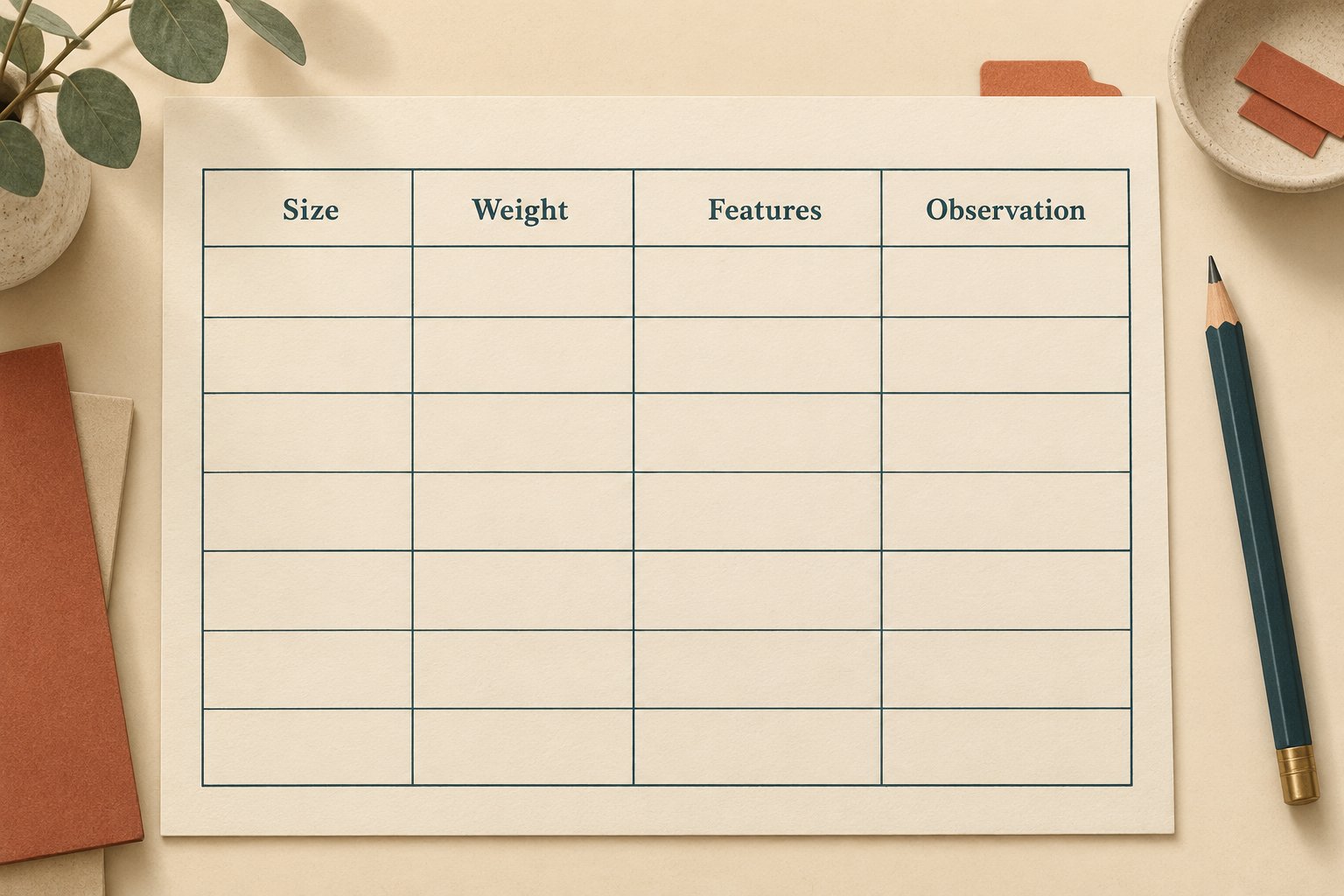
A useful first pass ends when your everyday sample is readable at your everyday settings and you can identify what you tested. It does not require cycling through every possible size or deciding that one font is universally best. If one row is unclear, isolate that row before changing several settings together.
5. Use the official specimen to narrow a problem
NAVER's live specimen offers an editable playground, a size ladder, a character-coverage check and a report template. Use its actual font rendering for visual comparison; our illustrations are only reminders of the review process. The coverage tool can help identify a character the font does not contain, which is a different question from whether a supported character renders well in your app.
Keep browser and editor observations separate. If the same sample looks right in the specimen but wrong in your editor, record both environments rather than declaring the problem fixed. If only one weight or size is affected, include that narrower case.

Before making a public issue, prepare a minimal report containing the exact sample, font/build/version evidence, app and OS versions, relevant settings, expected appearance and actual observation. Crop screenshots to the synthetic sample and remove private paths or unrelated content. Check existing issues first, and describe uncertainty honestly. A small reproducible case gives the maintainer something concrete to investigate.
Keep the completed card with your editor setup notes. If you later switch terminals, displays or font builds, it gives you a known comparison instead of relying on memory of how a character used to look.